Write my own study
This tutorial will take you through the process of writing a new chart study. We’re going to write a very simple study that will, for each tick, return the timestamp of the tick and a value randomly selected from one of the open, high, low, close values provided. We shall call our study RandomStudy.
Here’s how…
Defining an alias for the new study
All studies are referenced through an alias name. So we will need to create a new alias that will point to our new study class we’re creating. To do this, we will put a new <alias> tag into our aliasDefinitions.xml file in the resources folder of the bladeset we are going to put our study in.
<aliasDefinitions xmlns="http://schema.caplin.com/CaplinTrader/aliasDefinitions">
  <alias name="novox.charts.random-study"
    defaultClass="novox.charts.RandomStudy">
  </alias>
</aliasDefinitions>
Now that we know where to put our new study class: charts-bladeset/src/novox/charts/RandomStudy.js, go ahead and create the file.
Creating a skeleton study class
In order for our study class to work, it will need to extend the caplin.chart.Study abstract class. It will also need to call the parent constructor, and pass it it’s own argument(s).
novox.charts.RandomStudy = function(sAlias, mDerivationParams, oListener, mConfigOverrides) {
  caplin.chart.Study.call(this, sAlias, mDerivationParams, oListener, mConfigOverrides);
};
caplin.extend(novox.charts.RandomStudy, caplin.chart.Study);
In our our simple study, we’re just using the default configuration options defined in the parent Study class. If we chose to overwrite these default values, we can do so in the mConfigOverrides map. For instance, the Study class defines the representationTypes option, which describes what type of series the study will output.
A study can output multiple series (such as the Bollinger band), but will always output at least one series. The default value for the representationTypes option is ['spline']. Let’s say our study were to output two series, it would need to override the option with the value: ['spline', 'spline']. Please see this documentation to learn more about configuration options.
This tutorial will not implement localisation, so we shall overwrite the getDisplayName method.
novox.charts.RandomStudy.prototype.getDisplayName = function() {
  return 'random study';
};
Writing the study logic
Almost there! The last step requires us to create the evaluate method, write our study logic and then we’re done.
But first it will be useful to learn how our study is used by the chart API.
Studies are added to the Series object via the addStudy method. From that point on, the series object will manage the study for us. Whenever it receives chart data it will send it to the evaluate method. Our study will then use the enqueue study method to pass the data back to the series (or whatever the listener might be). The series object will in turn pass it back to the chart component (and optionally a transformation can be applied to the study if a study adapter is used).
Our study will output the data in this format: [ [ timestamp, value], … ] which is a common format for line (or spline) studies. The data it will receive will be the standard Caplin format for OHLC chart data: [ [ timestamp, open, high, low, close ], … ].
We said that our study will just use one of the open, high, low or close values in tho source data as its value. So with this knowledge we can write our study logic:
novox.charts.RandomStudy.prototype.evaluate = function(pData) {
  var point, output, randomIndex;

  for(var idx = 0, len = pData.length; idx < len; idx++) {
    point = pData[idx];
    randomIndex = Math.floor(Math.random() * 4) + 1;

    output = [
      point[0], // time stamp
      point[randomIndex] // either open, high, low or close
    ];

    this.enqueue(output, idx, pData);
  }
};
Of course a real study will most likely use the period option (passed to the study constructor in the "derivation params" map) or use any other custom options to determine how to calculate the study data. A study can also use another study as a source of its data. Bollinger band is an example of such a study.
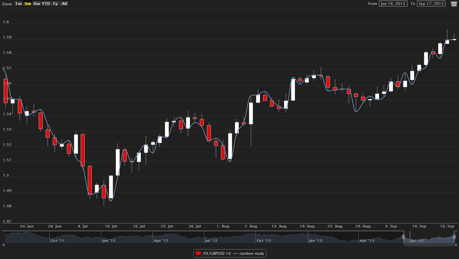
Our study is now complete and will look something like this when added to a chart (Blue Line):
