Architectural overview
This document provides a conceptual overview of the Caplin Grid, to help you configure and extend grids in your own application.
Features
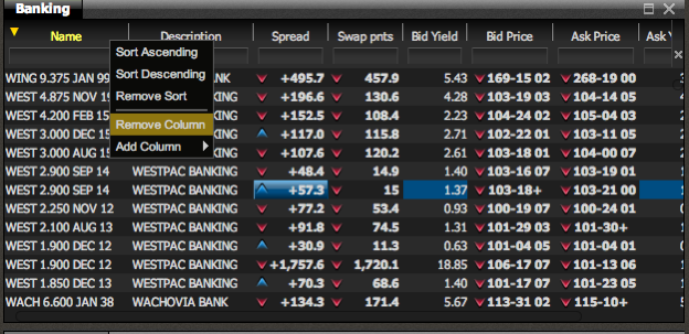
The image below shows a typical grid configured to display corporate bonds. It’s also showing a pop-up menu, that can be configured to perform actions on particular columns in a grid.
Basic Features
Superficially, a grid is quite similar to a table, comprising a body, which is a regular two-dimensional array of cells, and a header bar. The header bar is a single row of cells – one for each column in the grid – which display the column titles. Each header cell is the same width as the other cells in its column. The data in all cells (header or body) are formatted, styled and displayed by a renderer. Renderers../renderer/are specifically designed to co-operate with the grid, listening for changing data (e.g. prices) and displaying any updates in real-time.
Just below the header cells in the example above, you can also see a row of text-boxes. Users can type expressions into these boxes, to filter the values displayed in the column. This is achieved by using a composite renderer. Caplin supplies a set of renderers that cover most common requirements, but you are free to enhance these or add your own. Renderers are also commonly used to indicate stale data or the direction of price movements.
Hiding and Reordering Columns with Decorators
A grid can have a large number of columns defined, but doesn’t necessarily display all of them. The above example shows a context menu that was triggered by right-clicking in a header cell. It gives users the ability to change which columns are displayed. These sorts of enhancements are added using grid decorators. You can also change the order in which the columns are displayed. Again, Caplin supplies a set of decorators that cover common requirements and you can create and add your own decorators if you need to do so.
Windowing, Sorting and Filtering
One unique feature of the grid is its ability to display a small "window" of rows from a much larger container that is typically held on a server. In this case, a scrollbar appears to the right of the grid body, indicating the data-window’s size and relative position within the larger data-set. Initial data and updates are only sent for the window of data that is currently visible.
The grid subscribes to a data stream for each row of data that it needs to display, so that any changes in that row of data are immediately pushed to the grid. However, the grid only needs to be subscribed to the data streams that it has to display at that particular moment. When the user scrolls therefore, the grid unsubscribes from the data streams of the rows that are no longer visible, and subscribes those of the new rows. This means that users can scroll up and down tens of thousands of rows of data, with very low loading on the client and the network, making it incredibly quick and responsive.
Columns can also be sorted or filtered. When this happens, a request is sent to the server, which applies the filter criteria to the server-side container. The subscriptions for the "window" of data are automatically adjusted, and the required data, flows down to the client for display. Obviously, for this to work, you require a server that supports these windowing, sorting and filtering features. Caplin achieves this by providing a fully integrated stack with Caplin Liberator, Transformer and Streamlink.
Should you wish to do so, you can configure the grid to display data that is entirely cached in the browser, but such grids will not support the enhanced features.
XML Configuration
Grids are created when the GridComponentFactory processes your grid definition XML. You never need to create a grid directly, just supply the XML and the grid is created for you. Typically you can create a grid with a few tens of lines of XML and some CSS styling. Occasionally you may have to write bespoke renderers or decorators, which you then include in the XML configuration.
Class Structure
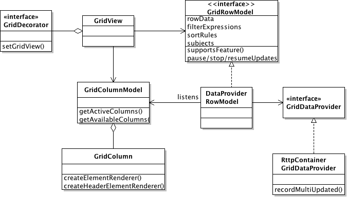
A (very) simplified UML diagram of the major parts of the grid is shown below:
The View Controller
The view layer is responsible for drawing the grid on the screen. The GridView class has overall control of this. The view objects listen for changes to the model objects (described below) that hold the data to be displayed. The GridView contains a list of all decorators that have been registered. Each decorator receives a reference to the GridView and can access its models and DOM elements as required to implement the necessary functionality.
The Model
The model describes the structure and data of the grid.
Each column in the grid is described by a GridColumn object, which is accessed via the GridColumnModel. The GridColumn contains information about (amongst other things) the column’s width, title, any filters applied to it, whether it can be sorted, etc… It also provides two methods: createElementRender(), which creates the renderer for every cell of the column; and createHeaderElementRender(), which creates the renderer used in the header cell for that column. At start-up, the view classes retrieve the renderers from the model, and then use them to display the data. The GridColumnModel allows you to add/remove and show/hide the grid columns, dynamically.
The actual data being displayed are held in the GridRowModel. GridRowModel is an interface, and as such you can provide your own implementation, and display any tabular data source. The view retrieves the data to be displayed by calling the getRowData(index) method, which returns a single row of data, with the specified (zero based) index. It returns a map of data, keyed to the name of the column. The view sets the size of the window being displayed, by calling the method setRowRange(). It is then the responsibility of the GridRowModel to fetch the data needed for that window.
The view can find out if the GridRowModel supports sorting and filtering by calling the supportsFeature() method. The model provides methods for retrieving and updating filter and sort expressions. It is possible to control data update for GridRowModels that provide streaming data, using the pauseUpdates()/resumeUpdates()/terminateUpdates() methods.
DataProviders
The DataProviderRowModel is an implementation of GridRowModel, which is supplied by Caplin. It provides access to streaming data that will (generally) come from a COMET server. To use it, you provide an implementation of the GridDataProvider interface. If using the Caplin Platform then use the data provider alias caplin.sljs-container-grid-data-provider to receive data from Liberator. If you use another server you can create your own GridDataProvider implementation. The GridDataProvider also co-ordinates with the GridRowModel,ensuring that the appropriate requests are sent to the server (via the GridDataProvider), when a column’s configuration data is changed.