Create a menu
This tutorial will guide you through creating a simple menu for your application using the menu library. Then we will look at more complex use cases.
Using the menu API and rendering a menu
The way the menu library works is by basically having a model representation of a menu which then will be rendered by a control. So let’s start by constructing a simple menu model with a couple of items:
function constructMenu()
{
       var menu = new caplin.menu.model.Menu();

       var item1 = new caplin.menu.model.Item({label: "item1"});
       item1.on('action', function() {
              console.log('I am ' + item1.getLabel());
       });

       var item2 = new caplin.menu.model.Item({label: "item2"});
       item1.on('action', function() {
              console.log('I am ' + item2.getLabel());
       });

       menu.append([item1, item2]);

};
This is the default way of adding items. For more details, see the menu library documentation.
As you can see, you can add a callback on each of the items listening to the default 'action' event. This event will be triggered when the item is clicked. We could also listen on the menu for events triggered from the child items:
var item1 = new caplin.menu.model.Item({label: 'item1', eventName: 'itemEvent'});

…

menu.on('itemEvent', function(item) {

       console.log('I am ' + item.getLabel());

});
We will now render the menu using the control:
var menuContainer = document.getElementById('myMenuContainer');
var menuControl = new caplin.menu.Control(menu, menuContainer);
menuControl.render();
The result will be a simple two-item menu.
Using the menu within Presenter
The menu library provides a simple presenter integration mechanism by providing a presenter control and a presenter control node.
These are the steps you will need to follow in order to integrate the menu with Presenter:
-
Add the Presenter menu control to your view:
<div class="menuContainer" data-bind="control:'caplin.menu', controlNode:menuNode"> -
Create the model and instantiate the control node with this model in your PM:
.menuNode = new caplin.presenter.node.Menu(menu); -
Call show/hide on your control node:
.menuNode.show(); || this.menuNode.hide();
Extending the menu (creating your own items)
The menu library provides an extension mechanism which will allow you to create your own models as well as your own ways of rendering them.
In order to render the items, the control maps a renderer per model type. This means that every time the control finds a model to render, it checks its type and requests the corresponding renderer to draw it. So, for example, a type 'item' model will be rendered by an ItemRenderer and so on. There are many ways that you can manipulate this behaviour; you can create your own generators (and tell the control to render existing types with these ones), create your own models (to be rendered by the generators you want), and so on. See caplin.menu.Control#addGenerator for more details.
Let’s illustrate this with an example:
-
We will start by creating the model representation of a checkbox item:
CheckboxItem = function(options) {
       options = caplin.core.MapUtility.mergeMaps([{type: 'checkbox-item'}, options]);
caplin.menu.model.Item.call(this, options);

       this.checked = options.checked || false;
};
caplin.extend(CheckboxItem, caplin.menu.model.Item);

CheckboxItem.prototype.onCheckboxAction = function() {
       this.checked = !this.checked;

       if (this.checked) {
              console.log('checkbox from item ' + this.getLabel() + ' is checked');
       }
}
In this case we have decided to extend
caplin.menu.model.Item. This is because we want to have the same structure adding an extra option, which will be the checked property that indicates that the checkbox is checked, and defining the type of this model (we could have overridden the getType method to return the checkbox-item type instead of merging maps). -
Let’s now create a generator for these item types:
CheckboxItemGenerator = function() {
       caplin.menu.generator.Item.call(this);

       this._checkboxListeners = [];
};

caplin.implement(CheckboxItemGenerator, caplin.menu.generator.Item);

CheckboxItemGenerator.prototype.create = function(model, container) {
       caplin.menu.generator.Item.prototype.create.call(this, model, container);

       var checkbox = document.createElement('INPUT');
       checkbox.type = 'checkbox';
       var checkboxlistenerID = caplin.dom.Utility.addEventListener(checkbox, 'click', function() {
              model.onCheckboxAction();
       });
       container.appendChild(checkbox);

       this._checkboxListeners.push(checkboxlistenerID);
};

CheckboxItemGenerator.prototype.destroy = function() {
       caplin.menu.generator.Item.prototype.destroy.call(this);
};
Here, again, we will be using the
caplin.menu.generator.Itemto render the label. However, this time, we will add a checkbox to the container. -
The final step is to register the generator:
var checkboxGenerator = new caplinx.fxtrader.presentermenu.workbench.CheckboxItemGenerator();
menuControl.addGenerator(checkboxGenerator, 'checkbox-item');
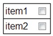
So our, from our first example, the code will look something like this:
function constructMenu()
{
  var menu = new caplin.menu.model.Menu();

  var item1 = new caplinx.fxtrader.presentermenu.workbench.CheckboxItem({label: "item1", eventName: 'itemEvent'});
  var item2 = new caplinx.fxtrader.presentermenu.workbench.CheckboxItem({label: "item2", eventName: 'itemEvent'});

  menu.append([item1, item2]);
  menu.on('itemEvent', function(item) {
    console.log('I am ' + item.getLabel());
  });

  var menuContainer = document.getElementById('myMenuContainer');
  var menuControl = new caplin.menu.Control(menu, menuContainer);
  var checkboxGenerator = new caplinx.fxtrader.presentermenu.workbench.CheckboxItemGenerator();
  menuControl.addGenerator(checkboxGenerator, 'checkbox-item');

  menuControl.render();
}
And this will be the result:
Using the menu factory (optional)
In order to simplify configurations for large menus, the menu library provides a MenuFactory which will allow you to create models in a simple way. See caplin.menu.model.MenuFactory for a full description of the possible configuration parameters. Let’s create our first menu with the factory:
var menuConfig =
{
       items: [{
              options: {
                     label: 'item1',
                     eventName: 'itemEvent'
              }
       },
       {
              options: {
                     label: 'item2',
                     eventName: 'itemEvent'
              }
       }]
};

var menu = caplin.menu.model.MenuFactory.create(menuConfig);
In order to create other item types (like the checkboxItem), we will reference the class names by alias. Note that if alias is not included it will create the default model types.
var menuConfig =
{
       items: [{
              alias: 'checkboxItemAlias'
              options: {
                     label: 'item1',
                     eventName: 'itemEvent'
              }
       },
….
Styling your menus
Now, let’s see how you can style a menu. This example will use the standard menu and item models and markup generated. However, as always, you can provide your own implementations and ways of rendering your models. Let’s first have a look to the markup generated by the first example’s menu:
<div id="myMenuContainer">
       <ul class="menu-items">
              <li class="item">
                     <div class="label">item1</div>
              </li>
              <li class="item">
                     <div class="label">item2</div>
              </li>
       </ul>
</div>
As you can see, the model type is the css class added to each of the models that it is inserted into a menu. You can also use the option property 'classifier' to add an extra css class to the models. In order to illustrate it, let’s insert another menu which will display its items on hover (following from the first example):
Code added:
var subMenu = new caplin.menu.model.Menu({label: 'submenu', classifier: 'hover-menu'});
subMenu.append(new caplin.menu.model.Item({label: 'item from submenu'}));
menu.append(subMenu);
Markup generated:
<div id="myMenuContainer">
       <ul class="menu-items">
              <li class="item">
                     <div class="label">item1</div>
              </li>
              <li class="item">
                     <div class="label">item2</div>
              </li>
              <li class="menu hover-menu">
                     <div class="label">submenu</div>
                     <ul class="menu-items">
                            <li class="item">
                                  <div class="label">item from submenu</div>
                           </li>
                     </ul>
              </li>
       </ul>
</div>
As you can see, this will generate an inline menu but, if we want submenu items only to be displayed whenever we hover over the item, we can simply add:
ul.menu-items .hover-menu:not(:hover) ul {
    display: none;
}
You’ll see that we have used the classifier. This means that if other submenus were added without this classifier, those will still behave as inline menus.