Architectural Overview
This page provides an overview of the basic structure of the Webcentric layout manager.
Webcentric is a layout manager that will enable you to control the look and feel of your application through the use of a simple XML configuration.
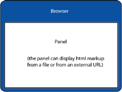
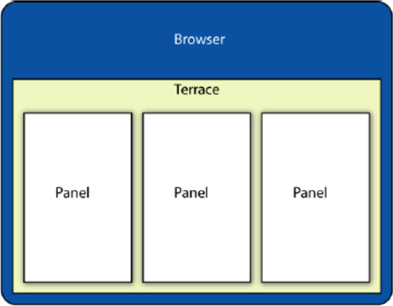
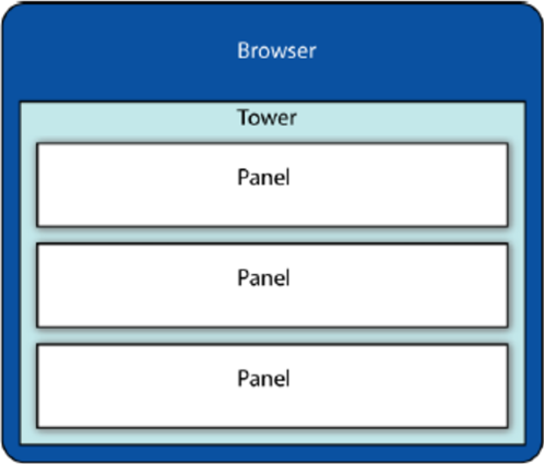
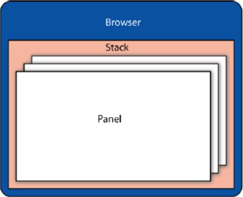
Each component in the application is embedded within a rectangular area called a Panel. By wrapping panels in layout components, these can then be arranged within the application horizontally (in what is known as a Terrace), vertically (a Tower), or one-behind-the-other, in tabs (a Stack).
The XML mark-up describing this layout, can be further extended with decorators that can provide the ability to drag and drop window components, add borders, etc… As well as configuring the layout of the GUI, it’s also possible to define a set of actions to evaluate scripts, open dialog boxes, and dynamically change attributes in the configuration, as well as to configure and use additional GUI components, such as buttons, dialog windows and an application menu.
Panels
Although a typical Caplin Trader client application will consist of a number of nested window components, the simplest GUI arrangement consists of a single <panel>, in which you can embed custom display components. The XML mark-up that defines a panel is as follows.
The <state> tags are containers for the XML configuration of the components inside the panels.
|
<GUI>
  <FrameItems>
    <caplin:Panel caption="Test Panel">
      <state>
        <!-- Caplin component xml. -->
      </state>
    </caplin:Panel>
  </FrameItems>
</GUI>
Any child components of the GUI must be marked up within <FrameItems> tags, which separate the definition of the GUI’s child components from other mark-up that may be defined inside the <GUI> element.
Terraces
A Terrace is used to group elements horizontally within an application layout. The following XML sample defines a <Terrace> with three panels. By default, the width of each panel is scaled, so that each is evenly distributed across the Terrace.
<GUI>
  <FrameItems>
    <Terrace>
      <FrameItems>
        <caplin:Panel />
        <caplin:Panel />
        <caplin:Panel />
      </FrameItems>
    </Terrace>
  </FrameItems>
</GUI>
Towers
A <Tower> is used to arrange elements vertically. By default, the height of each of the nested panels is equal to that of the other panels in the Tower.
<GUI>
  <FrameItems>
    <Tower>
      <FrameItems>
        <caplin:Panel />
        <caplin:Panel />
        <caplin:Panel />
      </FrameItems>
    </Tower>
  </FrameItems>
</GUI>
Stacks
A Stack is composed of panels, layered one on top of one another. Each panel fills the whole height and width of the <Stack> that contains it. (The panels in the illustration below are shown slightly smaller and offset, for demonstrational purposes only.)
<GUI>
  <FrameItems>
    <Stack>
      <FrameItems>
        <caplin:Panel />
        <caplin:Panel />
        <caplin:Panel />
      </FrameItems>
    </Stack>
  </FrameItems>
</GUI>
The Application Layout Stack
As well as the layout defined by Terraces and Towers, an application layout always contains an Application Layout Stack, which serves as the main container for draggable window components. Typically, windows outside the Application Layout Stack will not be draggable.
Setting up an Application Layout Stack is simple; all you do is add the attribute id="application-layout" to the <Stack> tag, and declare in the <Application> element, that this is the draggable container (using an xpath expression to identify the element):
<Application drag_container= "//*[@id='application-layout']">
  . . .
  <Stack id="application-layout">
    . . .
  </Stack>
  . . .
</Application>
Decorators
<Decorators> are configuration elements that will alter the layout components in some way, such as by adding a border around a Panel, as shown below:
<Application>
   <Declarations>
      <Decorators id="borderDecorator">
                  <Border border_width="2" border_color="#000000"/>
              </Decorators>
   </Declarations>
   . . .
   <caplin:Panel caption="Panel with border" decorators="borderDecorator">
      . . .
   </caplin:Panel>
   . . .
</Application>
More complex decorators can also define the configuration of a sub-section of the layout, which will then be appended where the decorator is applied.
Actions
Webcentric actions define runtime behaviour for altering the layout of the application. Actions are triggered by DOM events, such as menu item selection, or button clicks. Each action type can respond to the triggering event in various ways. For instance, it could close part of the layout, display a dialog window, or make a component visible. Actions can be invoked through the JavaScript API, or they can be declared within the application’s XML configuration as the actions for events on other layout components (such as a <Button>).
Internal Architecture
Webcentric’s architecture consists of a layout model, presentation and view:
-
The layout model is a hierarchical data structure that contains the de-serialised XML layout data, and which can be persisted at any time by serialising it back into XML.
-
The presentation level of the layout consists of a collection of objects corresponding to each node in the layout model, and containing the functionality and logic that applies to that object’s behaviour in the application. For example: a Terrace object will have embedded logic to arrange its contents horizontally, and adjust them whenever a new component is added or removed. When the layout is altered in this way, the model is updated accordingly.
-
The layout view constructs the actual HTML components with which the user will interact. For instance: a presentation-level object for a
<Border>with four sides will spawn four<div>elements. Any interaction with the layout is captured by the view which then relays events to the presentation.