Liberator Explorer
Liberator Explorer is a diagnostic tool supplied with Liberator; you can use it to quickly and easily inspect the values of objects in Liberator and send data to the Liberator.
During development, it’s often useful to look at the structure and current values of objects. For example, when you’re developing an Integration Adapter, you can use Liberator Explorer to subscribe to an object that the Adapter supplies and check that the Adapter is sending Liberator the correct data.
| Liberator Explorer is only intended for use in development environments. It isn’t secure enough to use in production systems. |
Features
Liberator Explorer has the following features:
-
Subscribe to the following datatypes:
-
Records
-
Generic objects
-
JSON
-
Containers
-
-
Navigate subscription data in a high-performance grid supporting click-through browsing of directories and containers
-
Set StreamLink subscription parameters
-
Customise the layout
-
Manage multiple Liberator connection configurations
-
Monitor the status of the Liberator, DataSource peers, and data services.
-
Export data in CSV format to clipboard and file
-
Publish contributions to Liberator
-
Browse, filter, and save the StreamLink log
-
Pause, resume, and restart a StreamLink connection
-
Keymaster Support
Default layout
Liberator Explorer has a customisable, three-pane layout. All panes are resizable and can host multiple components.
The image below shows the default, three-pane layout:
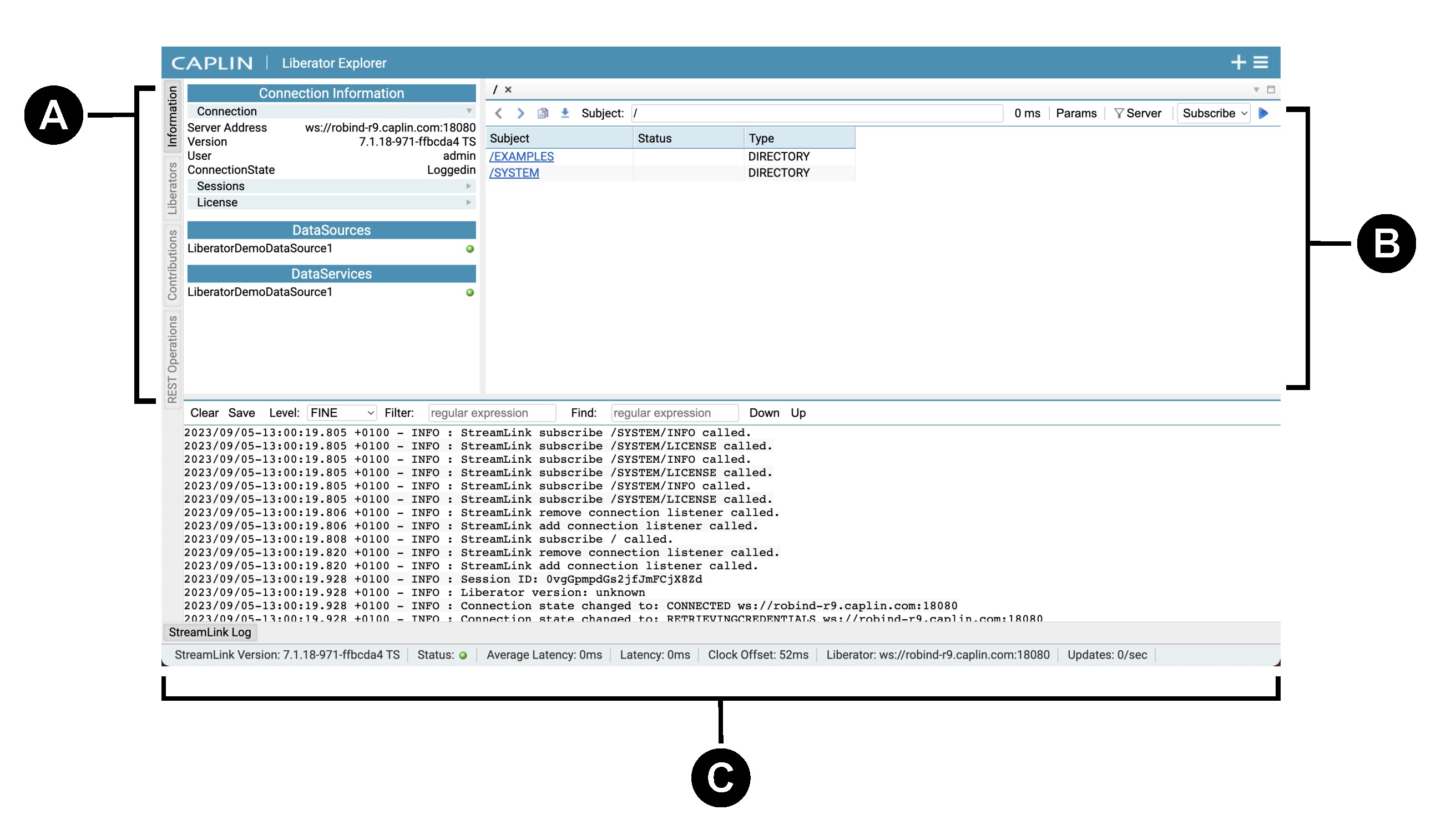
-
Control pane:
-
Information: view status of Liberator connection, DataSources, and data services.
-
Liberators: manage Liberator connection configurations.
-
Contributions: publish messages to a subject.
-
-
Data pane: open multiple subscriptions to subjects
-
Log pane: view, filter, and save StreamLink logs
Customising the layout
You can customise Liberator Explorer’s layout by adding new components and panes. Your customisations are retained in local browser storage and persist between sessions.
-
Click the New Tab icon (+) to add new subscription tabs.
-
Click the Main Menu icon () to add new components.
-
Drag pane borders to resize panes.
-
Drag component tabs to move components between panes and create new panes.
-
Click component tabs to expand and collapse their content.
See also: