Grids
Grids are used for displaying and updating data associated with several instruments (which have the same structure/fields) in a tabular format.
The grid is most commonly used as a front end visualisation of a container object from the server. Each row of the grid is a record object, and the columns in the grid map to the fields on the records.
Objectives
In this tutorial you will:
-
Create a grid which displays data from the /CONTAINER/FX/MAJOR container which you set up earlier in the Pricing Integration Adapter tutorial;
-
Understand how to organise the configuration of your grids to create grids from grid-templates;
-
Enhance your grid with some grid decorators.
Grid configuration
Grids are defined solely using XML configuration. This configuration is bundled by the XML Bundler and the grids are created when the GridGenerator processes the grid definitions XML.
Up to this point you have been working exclusively on the tile blade in your tutorial bladeset. For this tutorial we are going to use the other blade, which is called "grid". We will only be using the full application, not the workbench.
We will start by taking a look at the grid definitions configuration file for the application. Open CaplinTrader/apps/TutorialApp/tutorial-bladeset/grids/resources/xml/gridDefinitions.xml.
The grids section defines and names the grids which can be created by the application. A grid must define a number of columns, each of which is associated with a particular field.
A grid can also extend a grid template, and templates themselves can extend other templates.
A grid’s rows are filled by data from a data provider, which is an interface. The grid in this file is retrieving data from a StreamLink container subscription. In theory it is possible to write other data provider implementations so that you can put data from any source into a Caplin grid.
Additionally, a grid or grid template my include grid decorators in its configurations such as a decorator which allows columns to be resized.
Including the grid in your application
If you launch the application you will find that it contains many tiles but no grids. You’ll need to modify your Webcentric layout to contain another panel containing the grid. Open CaplinTrader/apps/TutorialApp/default-aspect/webcentric/layout/layouts/blank_layout.xml.
The easiest thing to do is change one of the existing <caplin:Panel> elements so that rather than display a tile it contains a grid. Find a panel in the layout (the first one will do) and change it to look like this:
<caplin:Panel caption="Majors Grid">
    <state>
        <caplin.grid-component baseGrid='mycompany.tutorial.grids.majorfxgrid'/>
    </state>
</caplin:Panel>
Remember to reset your Webcentric database before refreshing your app in the browser.
When you refresh the app you will see a grid with a single column "Currency Pair". There is no data in the grid yet.
Specifying grid columns
The aim of this tutorial is to create a grid which displays the bid and ask prices for several FX instruments. The fields of interest are the currency pair, bid price and ask price. This is common for all FX grids, not only the one we are creating. This is why we are going to define the columns in a shared grid template rather than the grid itself.
Have a look at the <columnDefinitions> element in the grid template. It currently includes only one column, which is bound to the InstrumentName field. You can define any number of columns in your column definitions.
Modify the template to include two other fields:
-
A column with the display name "Bid" which is bound to the "BidPrice" field;
-
A column with the display name "Ask" which is bound to the "AskPrice" field.
When you have added the new columns, you will still not see them in the application! You also need to add their IDs to the displayedColumns attribute of the <gridTemplate> element. This is because it’s possible to configure your grid to include columns that are not displayed by default - the user has to right click on the grid and add them.
This is useful for columns contanining less useful information which the end user might not be interested in seeing.
When you refresh your application, you should see that the grid now has three columns. There is still no data though. We will fix that next.
It is also worth noting that you don’t have to reset the Webcentric database after editing your gridDefinitions.xml! The grid configuration is not stored in the Webcentric database at all. The BladeRunnerJS XML bundler simply reads the XML files.
Specifying the container subject
Now that we have the correct columns in the grid, the last thing we need to wire up is the data provider. As usual, we are using the StreamLink data provider.
Recall that when you worked on the pricing integration tutorial you set up your pricing adapter to provide a container with the subject /CONTAINER/FX/MAJOR. If you look at your grid configuration you will find that it is trying to request a dummy subject /CONTAINER/NAME/HERE.
If you pop up the StreamLink log by appending ?debug=finer to the application URL you will be able to see the request for that subject going out to Liberator, but no adapter can provide it. So the grid gets a failure response from Liberator:
2014/06/18-10:14:59.868 +0100 - FINER : < 9O /CONTAINER/NAME/HERE NOT+FOUND
Fix the subject in your grid configuration and refresh the application. You should now see streaming rates in your grid.
You will notice that the column definitions are defined in your template, but the subject to request is defined in the grid itself. This is a very common pattern.
The subject to request is always on the grid, not the template. This allows you to have multiple FX grids all sharing the same columns, but requesting different containers. For example, you could easily create grids that request /CONTAINER/FX/MINOR and /CONTAINER/FX/G8 and inherit all of the standard FX-related columns from the template.
Add a grid decorator
We use the Decorator Pattern to add functionality to grids.
Grid decorators can enhance grids by providing functionality such as the ability to resize a column. New grid decorators can be developed if necessary, but the caplin.grid.decorator library contains a large number of handy pre-built decorators.
Refer to the API documentation on the website to find out which decorators are available.
One common decorator is for resizing columns. Let’s add a ColumnResizingDecorator to the grid.
Refer to this page for useful information on exactly which XML element you need to include in your grid definition for each decorator. In this case we want the alias caplin.column-resizing-decorator, so add this to your grid definition as shown below:
<grids>
    <grid id="mycompany.tutorial.grids.majorfxgrid" displayName="FX Major" baseTemplate="mycompany.tutorial.grids.fxgrid">
        <gridRowModel>
            <caplin.sljs-container-grid-data-provider container="/CONTAINER/FX/MAJOR" />
        </gridRowModel>
        <decorators>
            <caplin.column-resizing-decorator/>
        </decorators>
    </grid>
</grids>
Refresh the application and you will find that the dividing lines between the columns in the grid header now act as draggable splitters, allowing you to resize the columns as you see fit. When the grid serializes itself (using the mechanism we implemented in the previous tutorial) it saves the current width of the columns, so the user can arrange them as they see fit and save the layout.
You might be wondering how you would know to use the string caplin.column-resizing-decorator without referring to the website.
Open up CaplinTrader/sdk/libs/javascript/caplin/resources/caplin/grid/aliasDefinitions.xml and you will see the mapping between an alias that you include in your grid configuration and the class it maps to. This alias file is provided in the Caplin Trader SDK, along with the classes it references.
More decorators
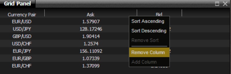
Experiment with adding more decorators such as the ColumnHeaderMenuDecorator which adds the possibility to bring up a context menu on the grid column headers with the options to show or hide columns and sort rows in the grid using Refiner.
-
You will need to find out which alias to use for this decorator, either from the website or the aliasDefinitions.xml configuration file.
-
Once you know which alias to use, you can add this decorator to the <decorators> section of your grid definition.
-
For this particular decorator to work correctly you will also need to disable the browser’s default context menu like this:
<body id="body" onContextMenu="return false;">. The main page can be found at CaplinTrader/apps/TutorialApp/default-aspect/index.html.
Try out a few of the other built-in decorators. One of the useful ones is the NoDataFoundBubbleMessageDecorator. Recall that when we had our grid configured with the wrong container subject, it just appeared with nothing in it. This decorator handles the NOT+FOUND response from Liberator by showing a helpful error message.
You could try adding this decorator to your grid, changing the container subject to something that won’t work, and see what the decorator does.
One of the interesting things about this decorator is that it can be parameterised. Refer back to the Available Decorators page. See what happens when you add attributes like to your grid configuration like this:
<caplin.grid-data-not-found-decorator
  connectionLostBodyText="Could not find any data"
  connectionLostHeaderText="Not Found">
</caplin.grid-data-not-found-decorator>
Review
This tutorial should have shown you how a grid is defined as a set of columns, each displaying a field from the data updates, which are received from a data provider. Additionally, you have seen how to create grids from grid templates, so you can have several grids being created from one template. Finally, you discovered the grid decorators available in the Caplin libraries and how these can be used to enhance the grid.
More information and tutorials about Grids can be found on the website. Also take a look at the XML reference for grids on the website.